We live in an age where advances in technology are driving the gains in productivity and profits, and then being discounted directly into share prices. Artificial intelligence (AI) is already well established and being used by most companies to improve productivity. This can be seen in the results coming out of the companies in the S&P500 index. The impact of AI has only just begun to be discounted and now the next major technological breakthrough, quantum computing, is hovering in the background.
Quantum computing is essentially a jump forward in hardware which allows computers to analyse multiple different solutions simultaneously. Instead of using bits which are either 1 or 0, a quantum computer uses qubits which can exist in multiple states simultaneously - together with quantum entanglement. The technology uses the laws of physics at the atomic and subatomic level to solve complex problems much faster than regular computers, even supercomputers. Microsoft, Google, Amazon, Oracle, and even Meta and Tesla, are rushing to install quantum computing into their infrastructure. In a word, quantum computing will increase the power of AI substantially making it even faster and more powerful than it already is.
With that background, the earnings of S&P companies for the third quarter are beginning to trickle in, with 19 companies having reported so far. Total 3rd quarter earnings for those companies that have reported results already are up +150.9% from the same period last year on the back of revenues which are +27% higher. 79% of those companies are beating EPS estimates and 73.7% are beating revenue estimates.
The average estimate for all S&P500 companies is that earnings will be up by 24,3% in the 3rd quarter when compared with a year ago – and this will be the 8th straight quarter where estimates have been in positive double digits. 15 out of 16 sectors are expected to make significant gains – led by the technology and energy sectors.
As things stand now, the progress of the S&P500 index is being significantly held back by developments in Trump’s Middle East war and the price of oil. Iran would like to hold the price of North Sea Brent above $100 per barrel, at least until after the mid-term elections on 3rd November 2026 – which of course is very bad news for the struggling Republican party and Trump.
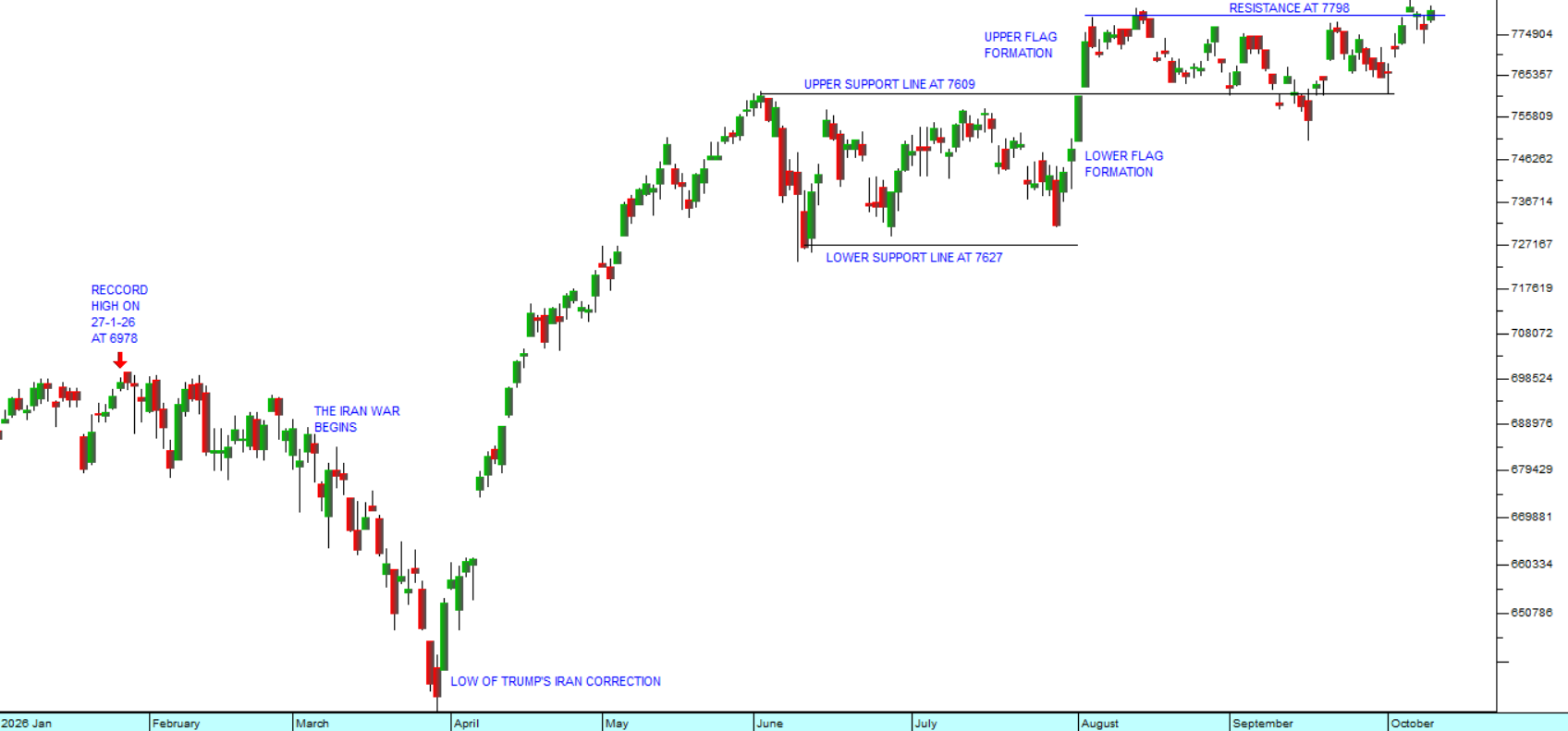
Looking at the chart, the S&P500 index has been moving through a series of protracted sideways markets for the past four months. During that time, technology and the prospects of that technology have not stood still. They have been advancing at a rapid pace.
Our belief is that as soon as the situation in the Middle East is resolved and the oil price comes back to where it was before the war began, the S&P will suddenly begin discounting the impact of the accumulated technical advances and move sharply higher. It will be like removing the lid from a pressure cooker. Consider the chart:
 S&P500 Index : January 2026 - 9th of October 2026. Chart by ShareFriend Pro.
So, what we are saying is that considerable bullish potential has been built up by this war and its impact on oil prices. This can be seen from the fact that even with Brent at over $100 a barrel now, the S&P is still making new record highs, based on the exceptional estimates of 3rd quarter earnings and beyond.
There are, of course, those who believe that Brent is about to go much higher – like to $125 per barrel - given the escalation in Yemen with the Houthis and the attacks on the Saudi pipeline. But in our view the underlying direction of the oil price must be downwards as the world moves away from fossil fuels and towards renewables, especially solar.
To be safe, ensure that you have a strict stop-loss level for all the shares in your portfolio. That is the ultimate protection against unexpected downtrends and bear markets. Your absolute rule should be to never lose more than 15% on any share market investment ever – including your dealing costs. Sometimes it is difficult to achieve this, but provided you always choose shares which are free-dealing, it simply becomes a matter of self-discipline. And then if you are able to make several hundred percent on your winners, mathematically, you must be successful over time.