MSCI Emerging Markets Index
6 July 2018 By PDSNET
That risk is mostly political – or at least political in origin. The state capture, corruption, nepotism and incompetence that characterises our state owned enterprises (SOE) and government departments cost us dearly when borrowing money from overseas investors. The ratings agencies (Moodys, Fitch and Standard and Poors) evaluate that risk and give us a rating.
And the international investment community is not always willing to invest here – even at the higher returns offered by emerging economies like South Africa. Sometimes they are “risk-off” which means that they withdraw from the riskier investments in emerging markets and put their money into relatively risk free investments like US treasuries. What causes them to do that is something like Donald Trump’s recent trade war with the rest of the world.
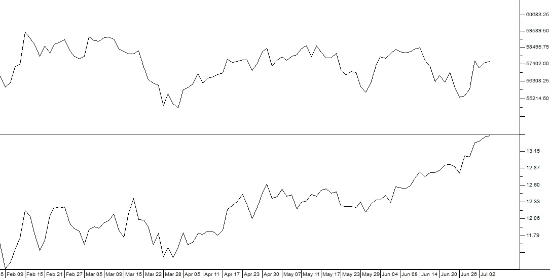
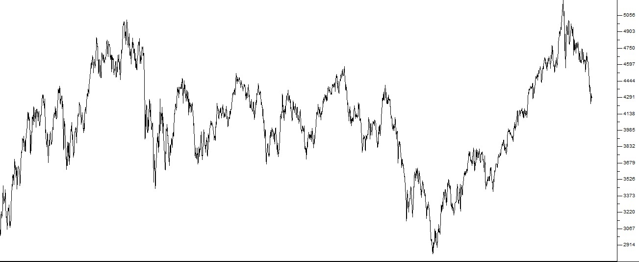
As a private investor it is interesting to compare our performance with that of other emerging markets and this can best be done by looking at the [cm_tooltip_parse]MSCI emerging markets index[/cm_tooltip_parse] (MSCI) which gives an average of the 23 emerging markets leading indexes. Consider the chart of the MSCI over the past 9 years:
MSCI Index (i-MSCI) 2009 to 2018 - Chart by ShareFriend Pro
Of course, during this nine-year period the first world stock markets have been in a protracted bull trend, so you can immediately see that emerging stock markets have been much more volatile – and have moved basically sideways. It is also interesting to use a comparative relative strength (CRSI) chart to compare the JSE Overall index with the MSCI. The CRSI chart simply divides one data stream (like the JSE overall) by another (like the MSCI) and draws a graph of the result. Consider the chart: