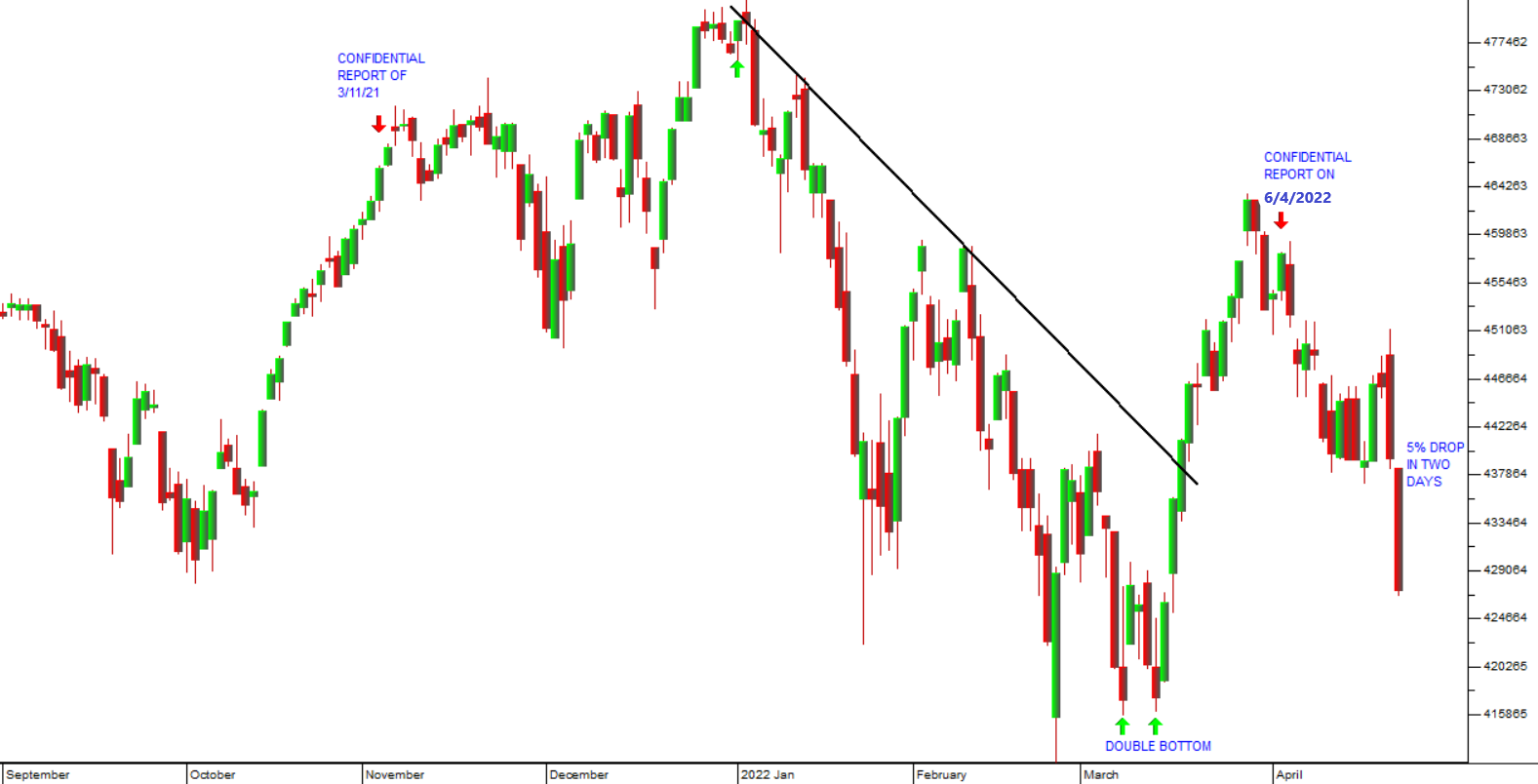
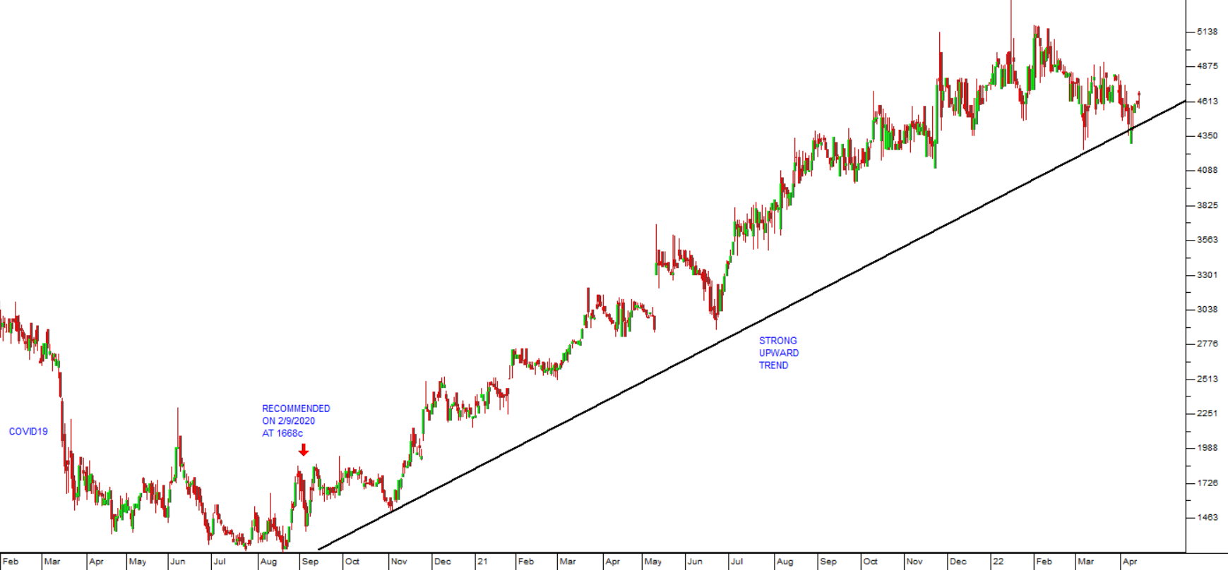
Linear vs Semi Log
11 April 2022 By PDSNETMost charts of share prices or indexes that you will come across are linear. The date is measured on X-Axis (horizontal) and the price or index level is measured on the Y-Axis (vertical). For short term charts linear scales are fine, but the longer your chart, the more misleading a linear chart becomes, especially for data streams which generally increase over time.
For example, look at the following 37-year chart of the JSE Overall index going back to April 1985:
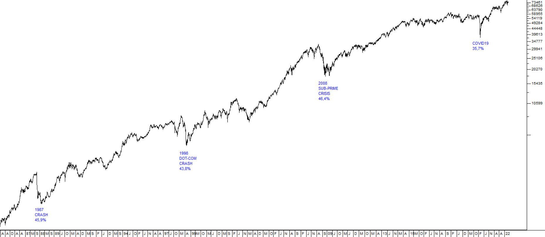
This chart is a semi-log chart. You can tell that because the index levels on the Y-axis (on the right-hand side) of the chart are compressed. On a linear chart they are evenly spaced.
You will see that we have identified four major downward trends in that index during the 37 years – the 1987 crash, the 1998 dot-com crash, the 2008 sub-prime crisis and the COVID-19 downward spike. The first three of these are very comparable, with the downward trend lasting between 4 and 6 months and taking the index down roughly 45% in each case. The COVID-19 downward trend was different, because it was not caused by normal economic events, but by the pandemic, which was an entirely unpredictable black swan event. It only took the index down 35,7% and it lasted for just 2 months. For these reasons we regard the COVID-19 spike as a technical “aberration”.
Now let us look at exactly the same chart over the same time period, but this time with a linear scale:
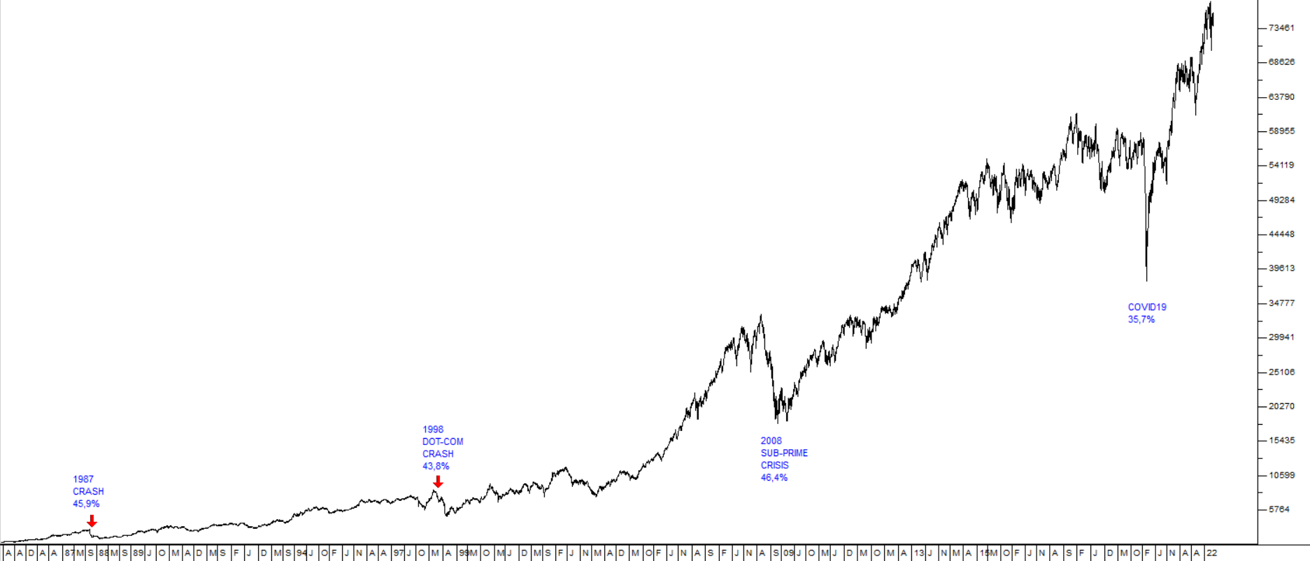
You can immediately see that the linear chart distorts the size of the various downward trends. The 1987 crash is now barely visible on the right-hand side of the chart and the 1998 dot-com crash is also significantly reduced in size, while the COVID-19 downtrend looks like the largest of these four events, even though it was in fact the smallest.
The point about a semi-log chart is that the distances on the chart represent the percentage moves rather than the moves in absolute index points. Thus, in the 1987 crash the index fell by 1517 points – but that was a 45,9% fall from its high of 2804. In the COVID-19 downtrend the index fell by 37963 index points, but that was only 35,7% of the high of 59002.
So, to sum up, it is very important when looking at charts of five years or longer that you use a semi-log scale and not a linear scale.
DISCLAIMER
All information and data contained within the PDSnet Articles is for informational purposes only. PDSnet makes no representations as to the accuracy, completeness, suitability, or validity, of any information, and shall not be liable for any errors, omissions, or any losses, injuries, or damages arising from its display or use. Information in the PDSnet Articles are based on the author’s opinion and experience and should not be considered professional financial investment advice. The ideas and strategies should never be used without first assessing your own personal and financial situation, or without consulting a financial professional. Thoughts and opinions will also change from time to time as more information is accumulated. PDSnet reserves the right to delete any comment or opinion for any reason.
Share this article: